Create an inspection template in the App Designer
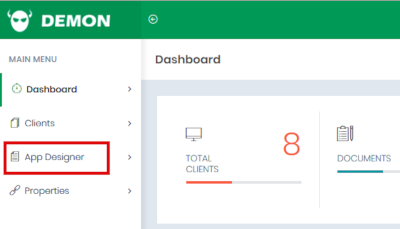
On the dashboard screen, click App Designer in the menu on the left.
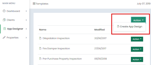
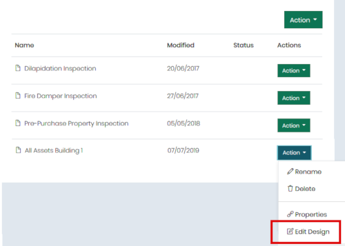
This will take to your list of app designs. “App design” is basically another term for “template”. Click the main Action button in the top right-hand corner and then select Create App Design from the dropdown menu.
This will raise the Create New Template dialog box.
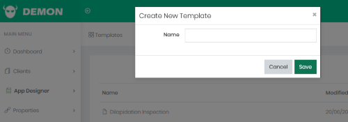
Enter a name for your new template and click Save. The name of your template should reflect the inspection that you’re about to design. For example, if it’s going to cover all assets in a particular building then you might name it “All Assets Building 1” or something like that. Or if it’s going to cover only smoke alarms but in any building, then you might name it just “Smoke Alarms”.
After clicking Save, you’ll find your new template at the bottom of the list. Click the Action button beside the template and select Edit Design from the dropdown list.
This will take you into the app designer. It will take a few seconds to load, and when it’s ready you’ll see a blank canvas like this:
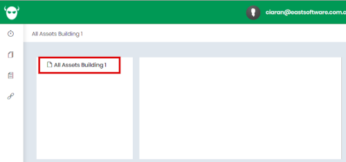
Click on the template name in the left-hand pane, and the right-hand pane will come to life. Now you’re ready to start designing your template.
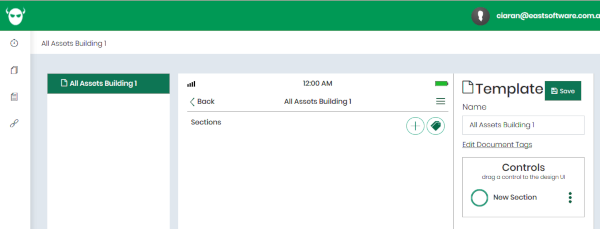
The left-hand pane shows your document structure, with sections and subsections. The middle pane is where you design each form in your app, and it shows what your app will look like on your phone or tablet. And the right-hand page hosts various controls and tools appropriate to whatever’s selected in centre pane.
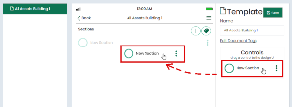
Initially your template is empty, so the first thing you’ll want to do is to create some sections. From this point onward all the decisions will depend on what you want your template to be like. For illustration we’ll design a simple template to show you how it’s done, but don’t just follow these examples – do it your own way.
Basic template design : sections, forms and controls
Let’s start with a section for general information about the job. Grab the New Section control in the toolbox in the right-hand pane and drag it onto the canvas in the centre pane.
Now click on the new section and you’ll see a new Form control added to the toolbox. A section can contain one form and any number of subsections. Go ahead and drag a new form onto the section.
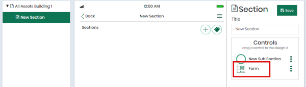
A dialog box will pop up to confirm that you want to create a form. The message in this box means that whenever you navigate to this section on your phone, this new form will be displayed. Click Create to create the form.

When the form is selected in the structure pane on the left, you’ll see more controls added to the toolbox in the right-hand pane. These are the things that you can add to a form.
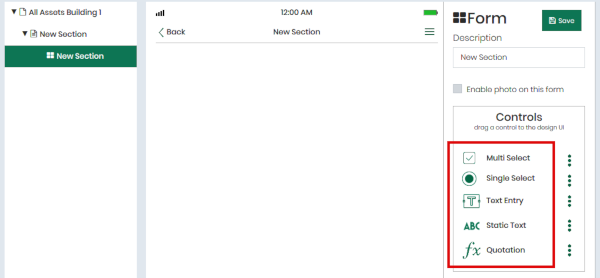
The controls you can add to a form are:
- Multi Select: A list of checkboxes. Your technician will be able to select any number of these items when he conducts his inspection.
- Single Select: A list of radio buttons. Your technician will be able to select only one item in this list.
- Text Entry: A field where your technician can enter any text. You can also set the text here in the designer.
- Static Text: A text label that will be displayed on the form, but your technician will not be able to edit its text. You set the text here in the designer.
- Quotation: Ignore this for now.
Text fields
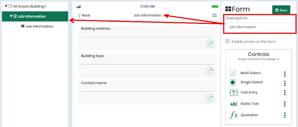
Since this section is the general job information section, we really just want some text fields for things like the client name, the building address and so on. So drag a few text entries onto the form and then edit them to suit yourself. Here’s an example.
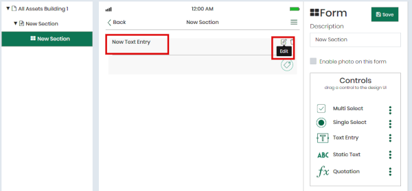
A text entry can have a caption as well as the text that your technician will enter during his inspection. Initially the caption is set to “New Text Entry”; to change this, click the Edit button on the right-hand side of the text entry.
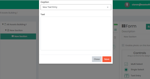
You can also preset the text entry’s text here if you like, but you’ll only want to do that when you want it to have the same preset value in every document that you create from this template.
In the following illustrations you’ll see that we’ve changed the caption to “Building address”, and added a few more text entries. And to finish the section we’ve change its description to “Job information”. You can do this in the Description box in the right-hand pane.
Checklists
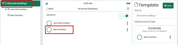
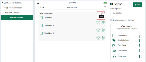
Next let’s create a checklist form, which is where the real content of the inspection goes. Go back to the root of the inspection in the left-hand pane and then drag a new section onto the canvas in the centre pane.
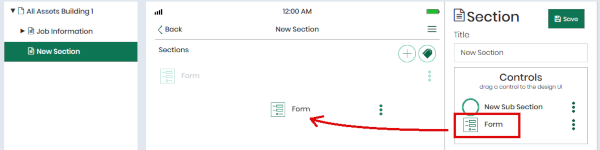
Then select this new section and add a form to it, same as before, and then drag a multi-select list onto the new form.
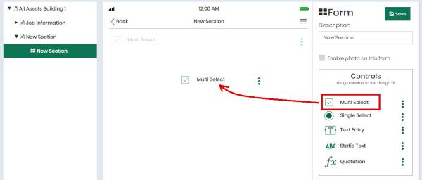
The app designer automatically creates three checkboxes in the list. To edit these checkboxes, and to add or remove checkboxes, click the Edit button on the list to open the multi-select list editor.
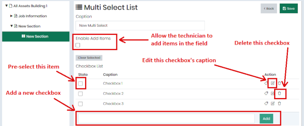
In the multi-select list editor you can also pre-select any checkboxes. And you can allow the technician to add items to the list in the field.
Note that you can create many multi-select lists on a single form. This way you can break a long checklist into smaller chunks, each with its own list caption and possibly with text fields between them.
Photos
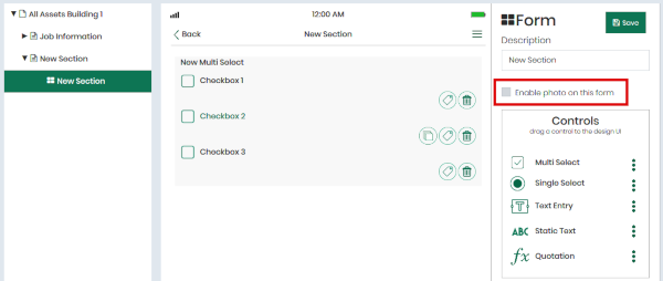
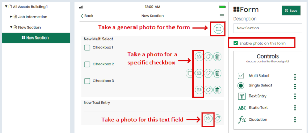
You’ll probably want your technicians to be able to take photos of everything. In Rebel every photo is automatically associated with a single control: a checkbox, a radio button or a text field.
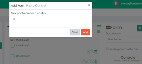
To enable photos on a form, check the Enable photos on this form checkbox.
This will raise the Add Form Photo Control dialog box, where you can enter the maximum number of photos allowed for each control.
Once you’ve enabled photos on the form you’ll see a photo button on every control, and one on the form itself. When your technician wants to take a photo relating to a specific checkbox or text field, he taps the corresponding button. Or if he wants to take a general photo that’s not related to any specific item then he taps the photo button on the form.
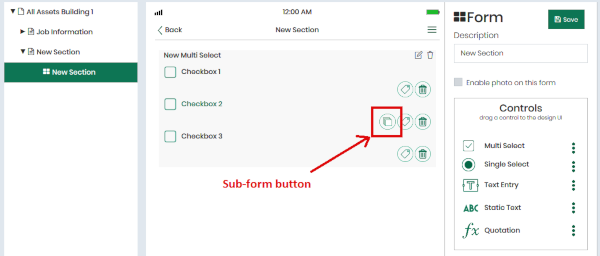
Subforms
To make a sub-form that opens when the technician taps on an item, click the Edit button on the checkbox.
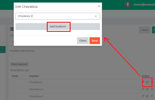
Normally you’ll use this to set the checkbox caption, but if you click the Add Subform button then the designer will create a new subform. You can add controls to this subform in the same way as you did for the first form.
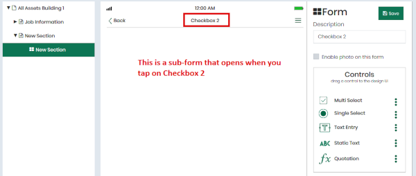
When you return to the first form you’ll see that Checkbox 2 is now coloured green and has a subform button. You can click on the checkbox itself or on the subform button to open the subform.